Plot design

Day 04

Prof Amanda Luby

Carleton College
Stat 220 - Winter 2026

Today

  • ggplot2 review
  • customizations in ggplot2
  • Some guidelines for plot design

What we know:

  1. A basic set of geometries
  • geom_point()
  • geom_histogram()
  • geom_boxplot()
  • geom_violin()
  • geom_bar()
  1. How to map variables to aesthetics
  • x and y axis
  • color
  • shape
  • alpha
  • size
  1. How to change axis labels and titles
  • labs()

What next?

  • Setting aesthetics
  • Using facets
  • Changing scales
  • Changing coordinates
  • Changing themes
  • Adding annotations

Survivor

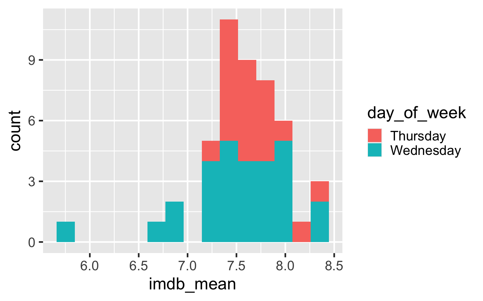
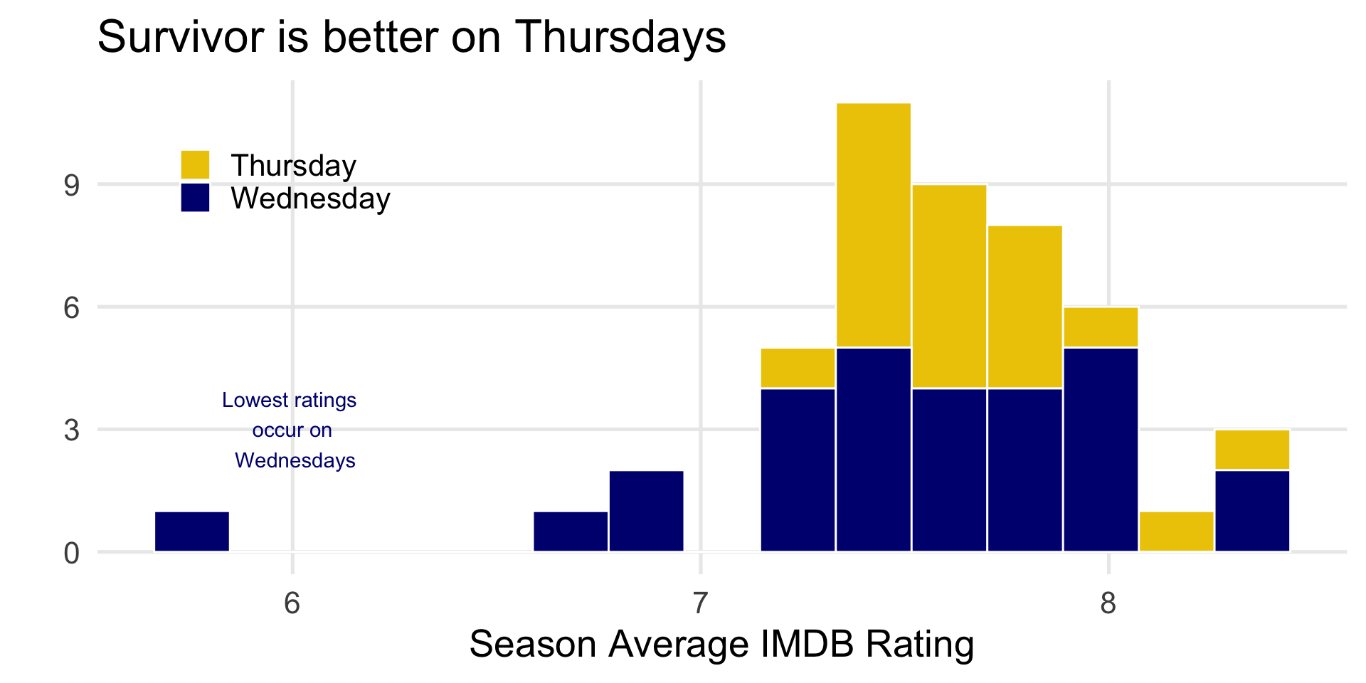
From Season02 to Season 20, Survivor aired on Thursdays. After Season 20, it switched to airing on Wednesdays. Thursday is better for my schedule, so I’d like to make an argument for switching back to Thursdays.

Warm Up

  1. Log into maize
  2. Find the .qmd template for today at the course website
  3. Open it up in maize/Rstudio
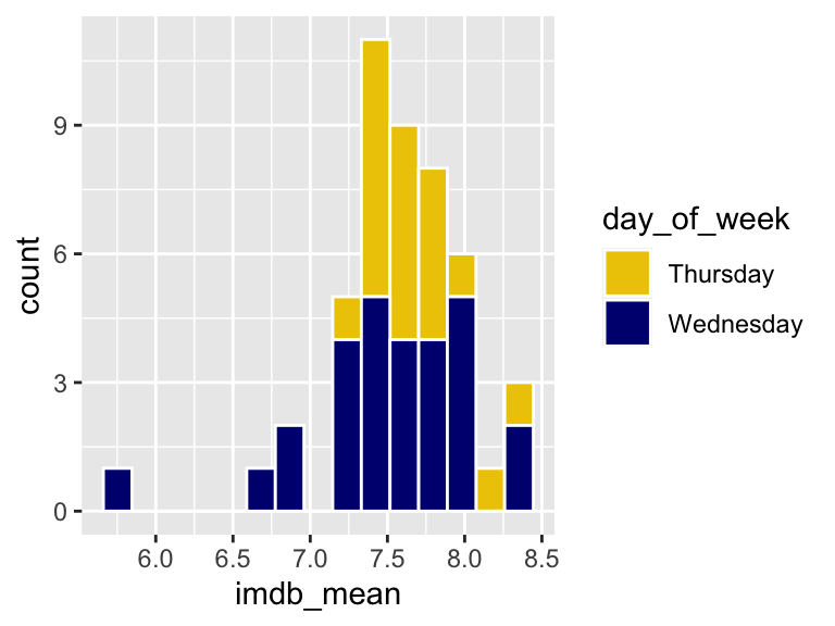
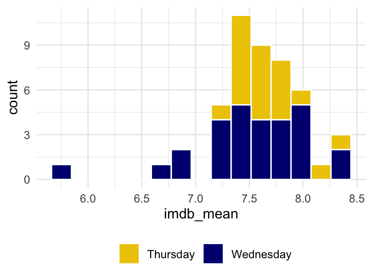
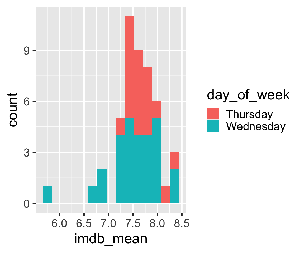
  4. Work with a neighbor to recreate this graph → (use 15 bins)
08:00

Polishing plots
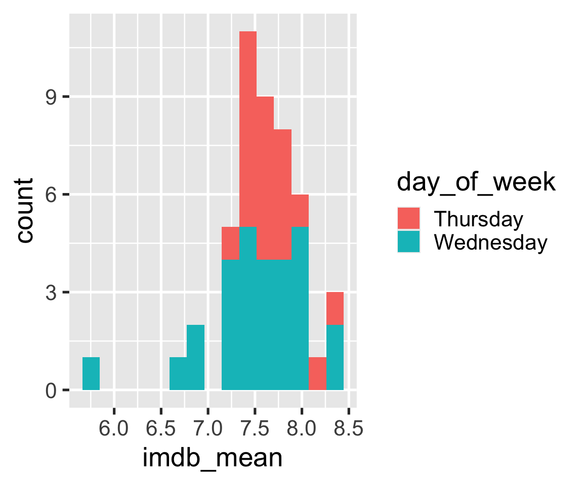
We’re not quite satisfied….

  • I want the bars to have a border that stands out
  • I find stacked histograms hard to read
  • I don’t like the default color scheme
  • I don’t like the gray background

Setting aesthetics

Setting = choosing a certain value for an aesthetic
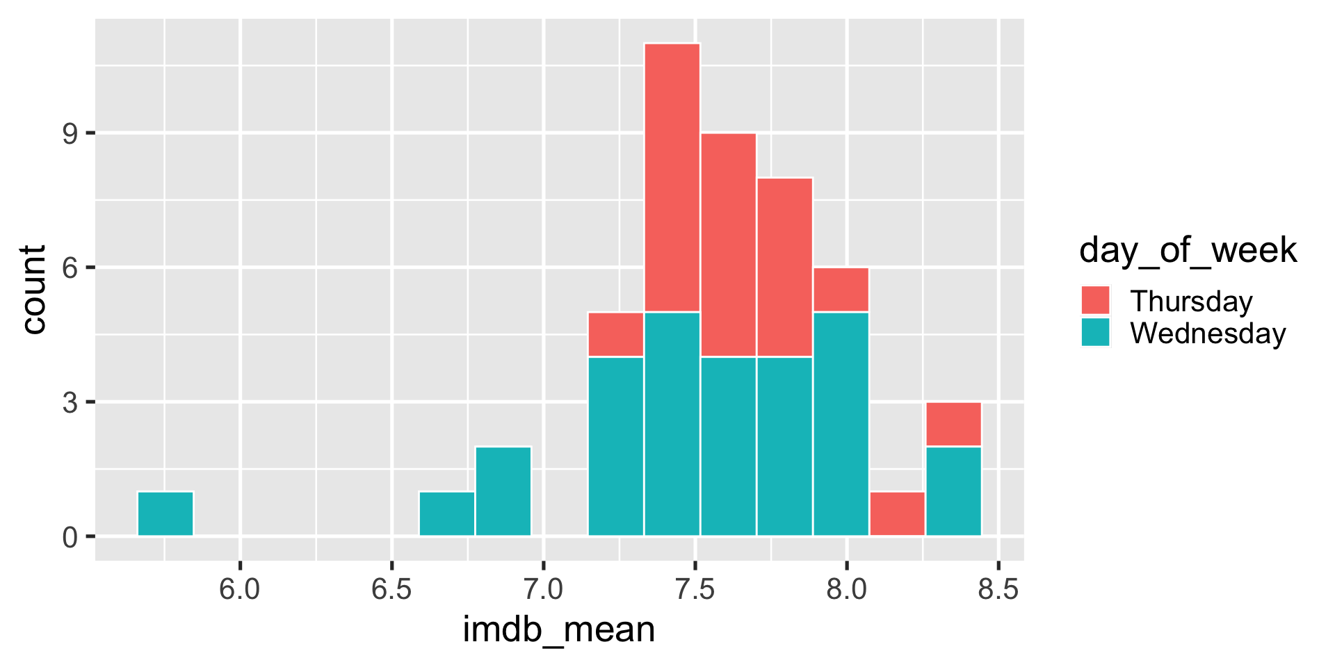
ggplot(season_summary) + 
  geom_histogram(
    aes(x = imdb_mean, fill = day_of_week), 
    bins = 15,
    color = "white"
    ) 

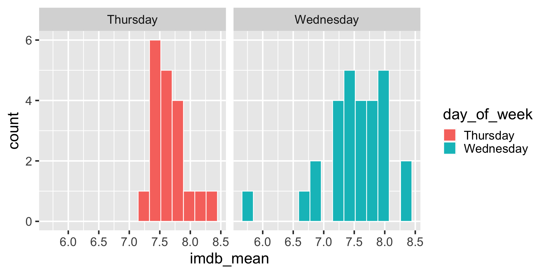
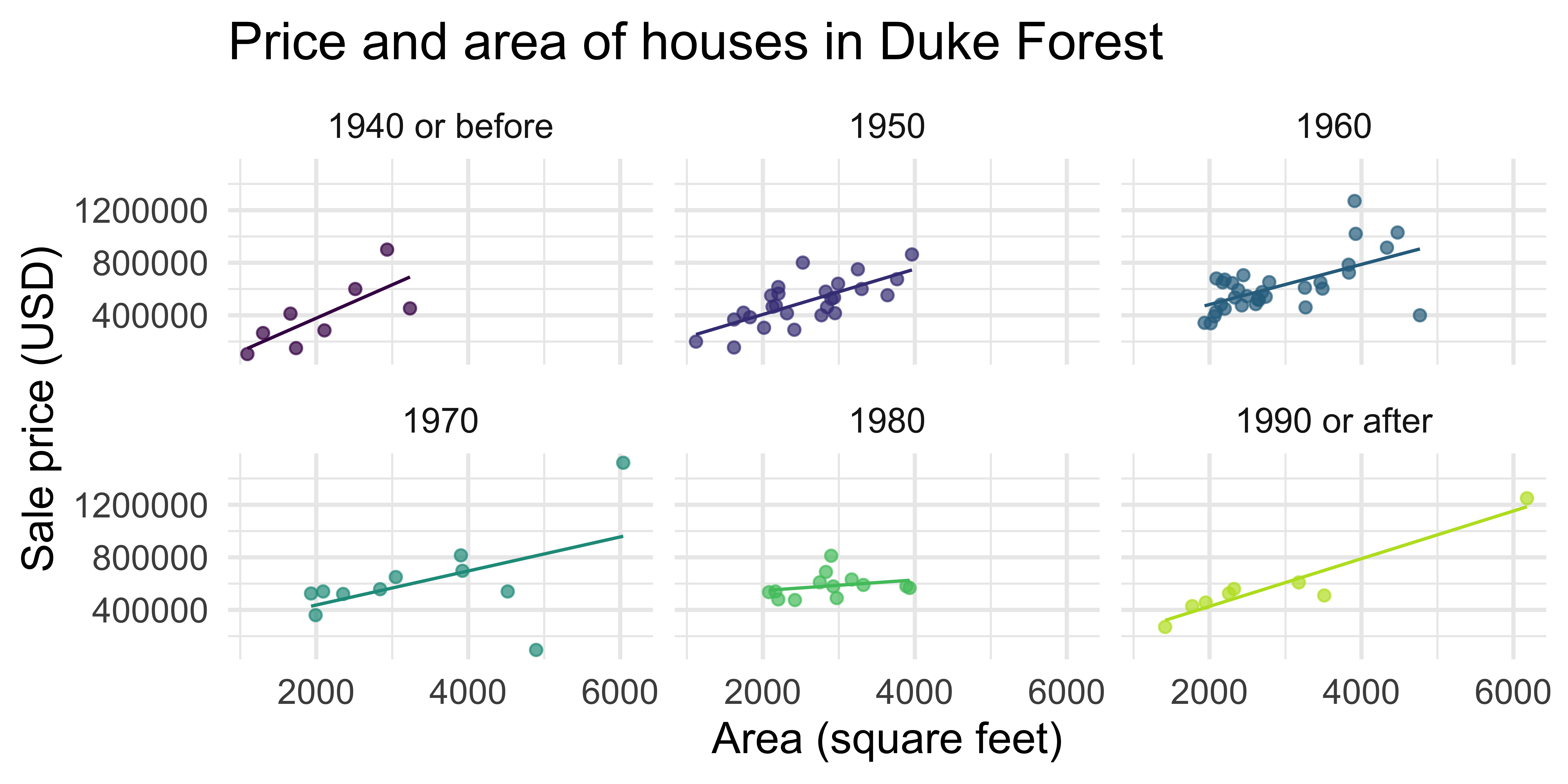
Facets

ggplot(season_summary) + 
  geom_histogram(
    aes(x = imdb_mean, fill = day_of_week), 
    bins = 15,
    color = "white"
    ) +
  facet_wrap(vars(day_of_week))

Changing scales

scale_<aes>_<method>()

Examples:

  • scale_fill_manual()

  • scale_fill_brewer()

  • scale_color_viridis()

  • scale_shape_manual()

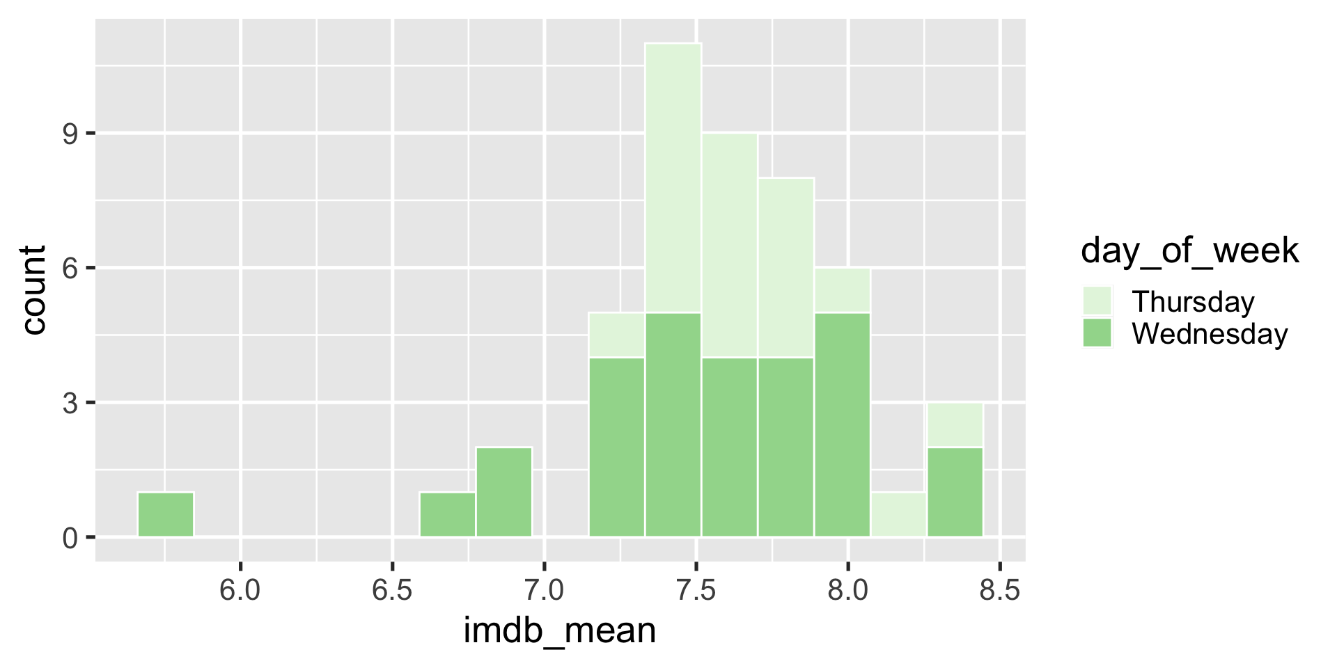
Example (built-in scale)

ggplot(season_summary) + 
  geom_histogram(
    aes(x = imdb_mean, fill = day_of_week), 
    bins = 15,
    color = "white"
    ) + 
  scale_fill_brewer(palette = "Greens")

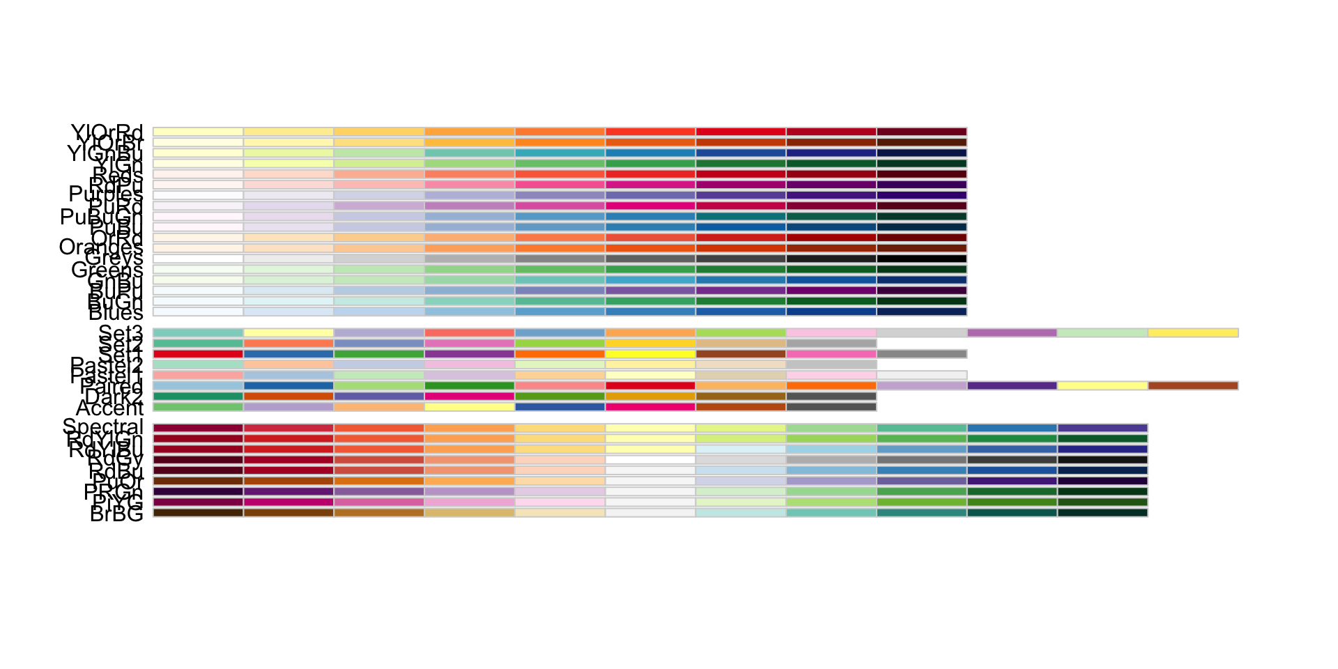
Example (built-in scale)

RColorBrewer::display.brewer.all()

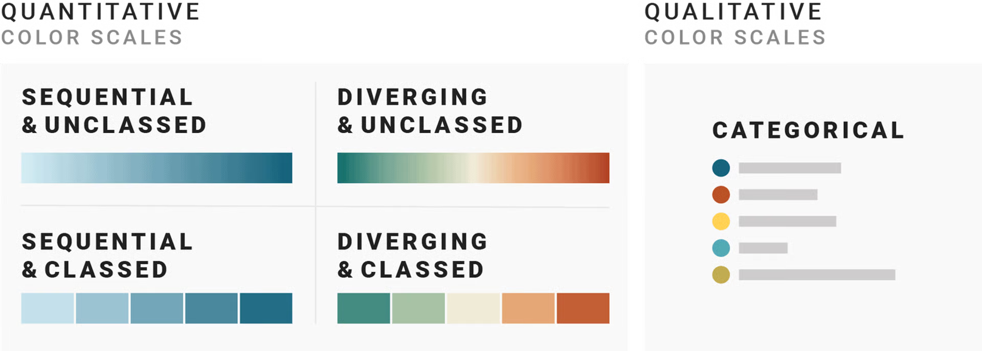
Aside: types of color scales

Example (manual color palette)

Let’s make Wednesdays navyblue and Thursdays gold2
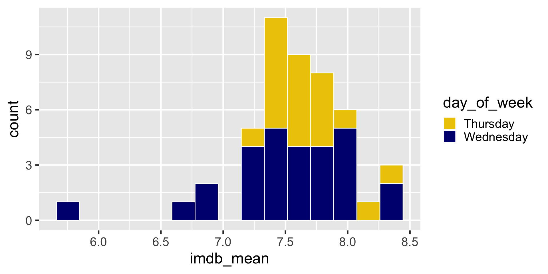
ggplot(season_summary) + 
  geom_histogram(
    aes(x = imdb_mean, fill = day_of_week), 
    bins = 15,
    color = "white"
    ) + 
  scale_fill_manual(values = c("gold2", "navyblue"))

Can also change non-color scales

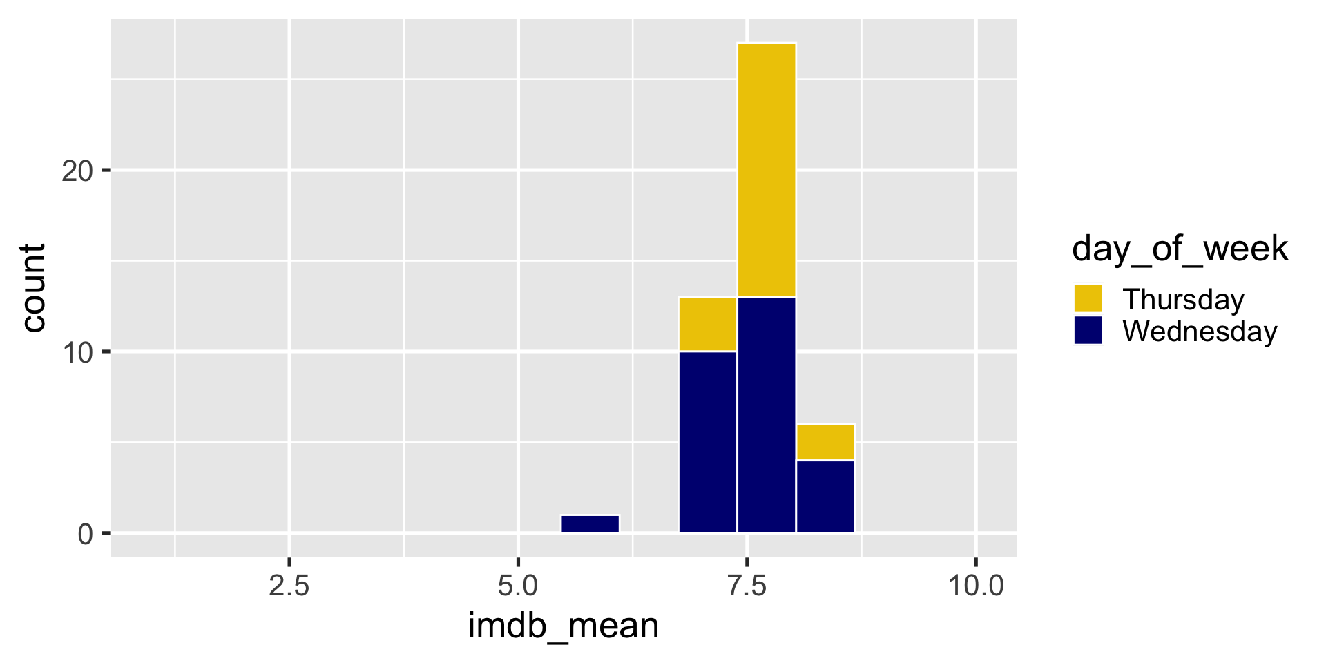
ggplot(season_summary) + 
  geom_histogram(
    aes(x = imdb_mean, fill = day_of_week), 
    bins = 15,
    color = "white"
    ) + 
  scale_fill_manual(values = c("gold2", "navyblue")) + 
  scale_x_continuous(limits = c(1,10))

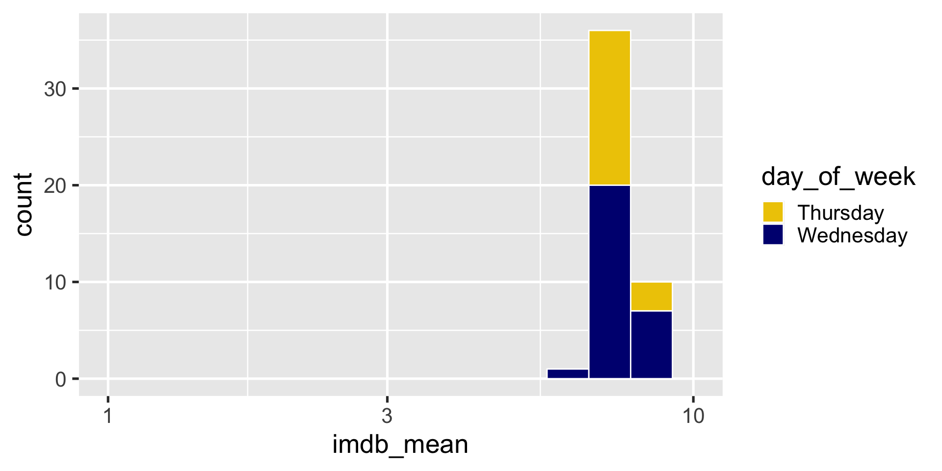
Can also change non-color scales

ggplot(season_summary) + 
  geom_histogram(
    aes(x = imdb_mean, fill = day_of_week), 
    bins = 15,
    color = "white"
    ) + 
  scale_fill_manual(values = c("gold2", "navyblue")) + 
  scale_x_log10(limits = c(1,10))

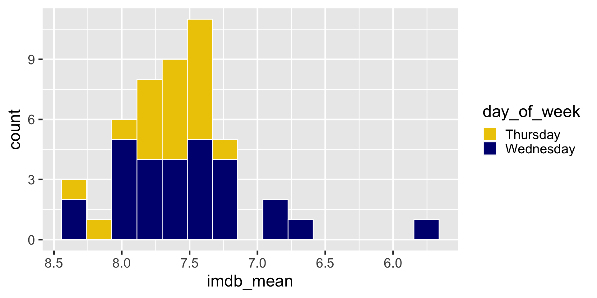
Can also change non-color scales

ggplot(season_summary) + 
  geom_histogram(
    aes(x = imdb_mean, fill = day_of_week), 
    bins = 15,
    color = "white"
    ) + 
  scale_fill_manual(values = c("gold2", "navyblue")) + 
  scale_x_reverse()

Changing Themes

Theme: The non-data ink on your plots

  • background
  • tick marks
  • grid lines
  • font
  • legend position
  • legend appearance

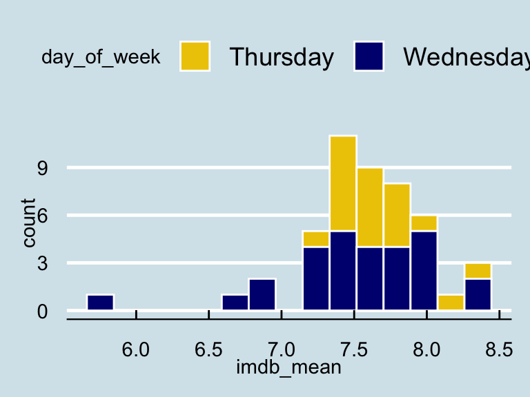
Prepackaged themes

ggplot2 themes

  • theme_grey()
  • theme_bw()
  • theme_linedraw()
  • theme_light()
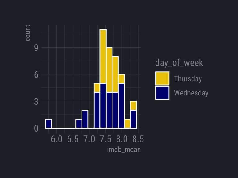
  • theme_dark()
  • theme_minimal()
  • theme_classic()
  • theme_void()
  • theme_test()

ggthemes themes

  • theme_clean()
  • theme_economist()
  • theme_excel()
  • theme_fivethirtyeight()
  • theme_gdocs()
  • theme_solarized()
  • theme_stata()
  • theme_tufte()
  • theme_wsj()
  • And more!

Using a prepackaged theme

ggplot(data = <DATA>) + 
  <GEOM_FUNCTION>(
     mapping = aes(<MAPPINGS>)
  ) +
  <FACET_FUNCTION> +
  theme_<name>()  

Try it

Apply theme_light() to the histogram
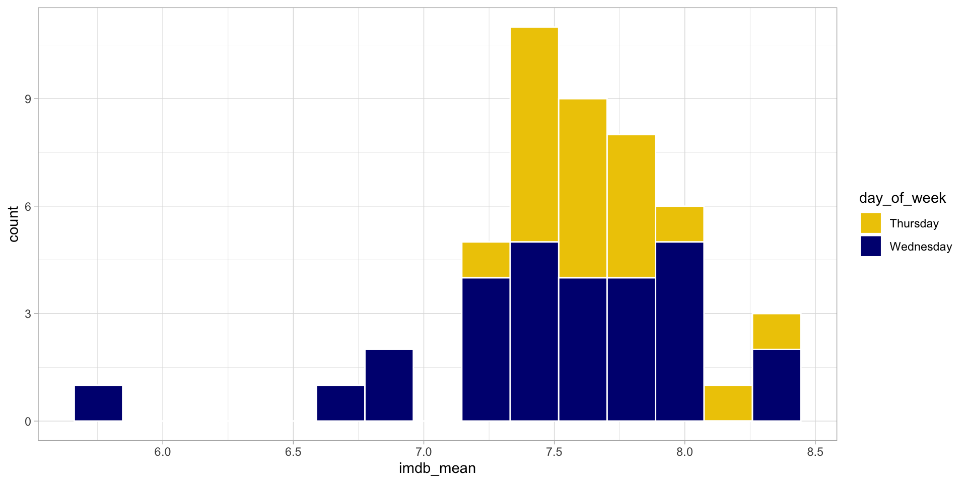
00:30
Even more customizations

  • Move legend
  • Clean up labels and title
  • Get rid of .5’s in x-axis
  • Annotations

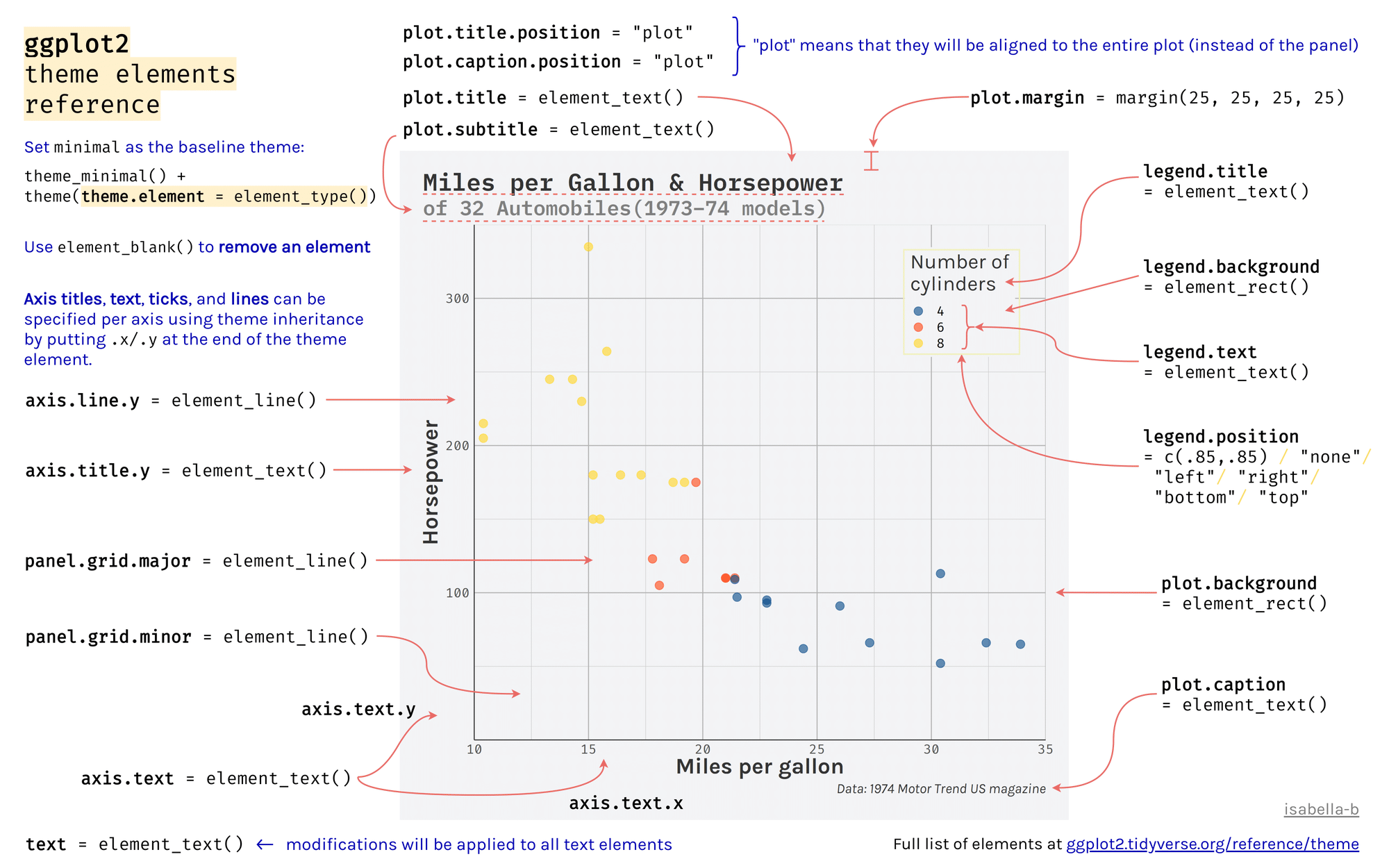
?theme

theme(line, rect, text, title, aspect.ratio, axis.title, axis.title.x,
  axis.title.x.top, axis.title.x.bottom, axis.title.y, axis.title.y.left,
  axis.title.y.right, axis.text, axis.text.x, axis.text.x.top,
  axis.text.x.bottom, axis.text.y, axis.text.y.left, axis.text.y.right,
  axis.ticks, axis.ticks.x, axis.ticks.x.top, axis.ticks.x.bottom,
  axis.ticks.y, axis.ticks.y.left, axis.ticks.y.right, axis.ticks.length,
  axis.line, axis.line.x, axis.line.x.top, axis.line.x.bottom, axis.line.y,
  axis.line.y.left, axis.line.y.right, legend.background, legend.margin,
  legend.spacing, legend.spacing.x, legend.spacing.y, legend.key,
  legend.key.size, legend.key.height, legend.key.width, legend.text,
  legend.text.align, legend.title, legend.title.align, legend.position,
  legend.direction, legend.justification, legend.box, legend.box.just,
  legend.box.margin, legend.box.background, legend.box.spacing,
  panel.background, panel.border, panel.spacing, panel.spacing.x,
  panel.spacing.y, panel.grid, panel.grid.major, panel.grid.minor,
  panel.grid.major.x, panel.grid.major.y, panel.grid.minor.x,
  panel.grid.minor.y, panel.ontop, plot.background, plot.title,
  plot.subtitle, plot.caption, plot.tag, plot.tag.position, plot.margin,
  strip.background, strip.background.x, strip.background.y,
  strip.placement, strip.text, strip.text.x, strip.text.y,
  strip.switch.pad.grid, strip.switch.pad.wrap, ..., complete = FALSE,
  validate = TRUE)

Move legend and make the background transparent
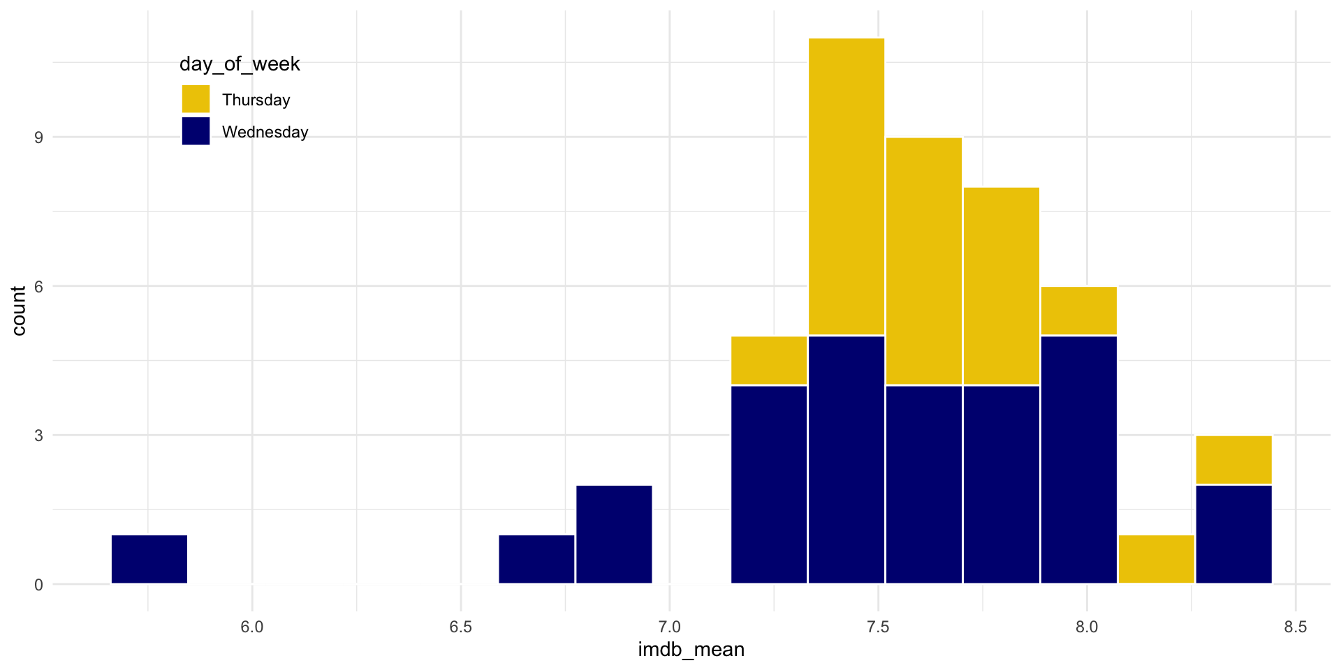
ggplot(season_summary) + 
  geom_histogram(
    aes(x = imdb_mean, fill = day_of_week), 
    bins = 15,
    color = "white"
    ) + 
  scale_fill_manual(values = c("gold2", "navyblue")) + 
  theme_minimal() + 
  theme(
    legend.position = c(.15, .85),
    legend.background = element_blank()
  )

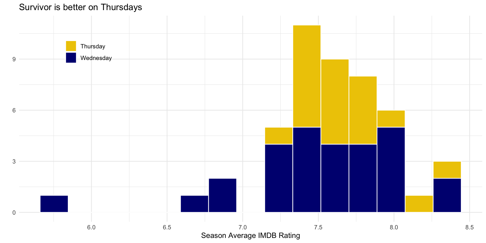
Clean up labels and title

ggplot(season_summary) + 
  geom_histogram(
    aes(x = imdb_mean, fill = day_of_week), 
    bins = 15,
    color = "white"
    ) + 
  scale_fill_manual(values = c("gold2", "navyblue")) + 
  theme_minimal() + 
  theme(
    legend.position = c(.15, .85),
    legend.background = element_blank()
  ) + 
  labs(
    x = "Season Average IMDB Rating",
    y = "",
    fill = "",
    title = "Survivor is better on Thursdays"
  )
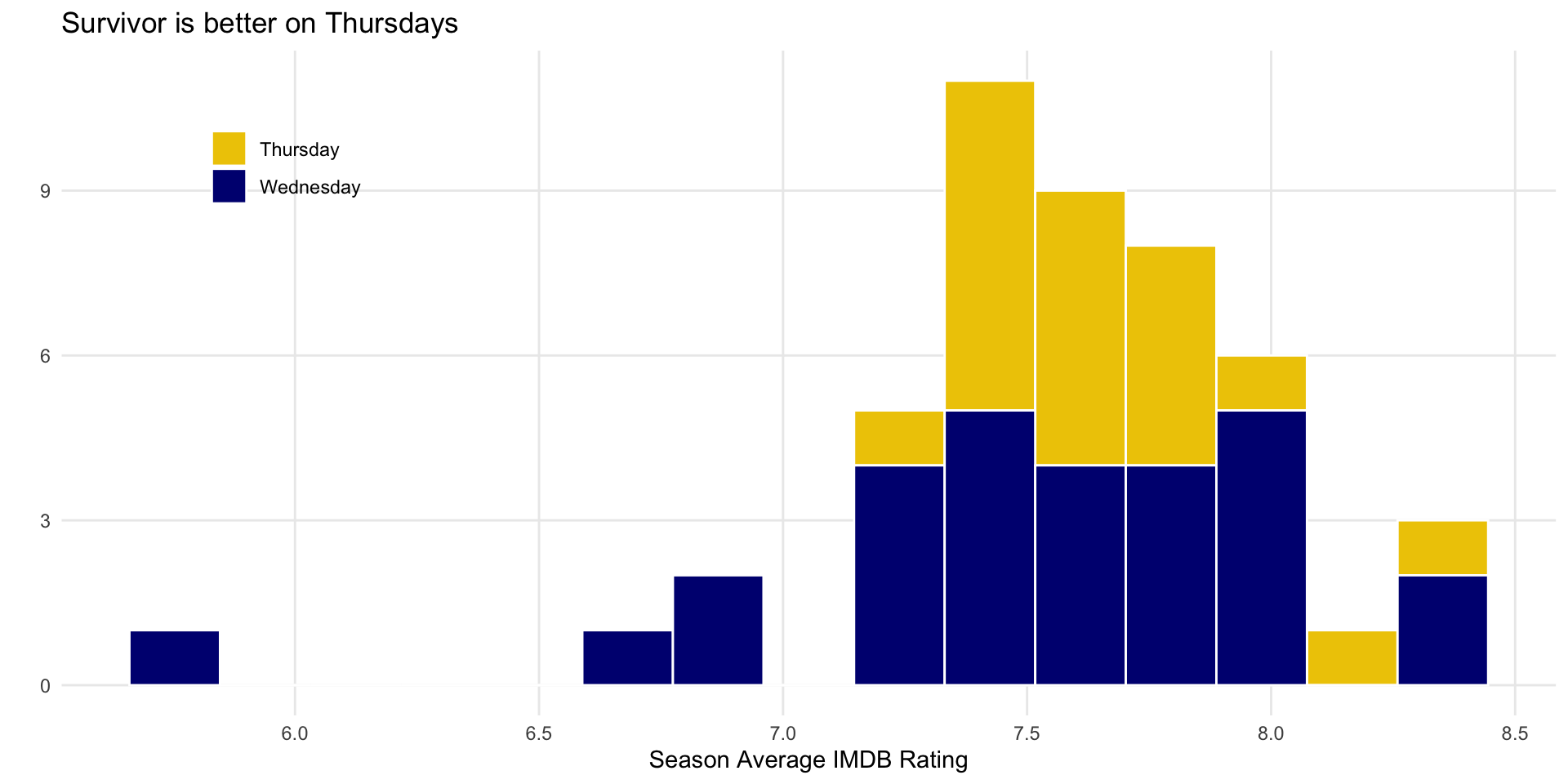
Remove minor gridlines

ggplot(season_summary) + 
  geom_histogram(
    aes(x = imdb_mean, fill = day_of_week), 
    bins = 15,
    color = "white"
    ) + 
  scale_fill_manual(values = c("gold2", "navyblue")) + 
  theme_minimal() + 
  theme(
    legend.position = c(.15, .85),
    legend.background = element_blank(),
    panel.grid.minor = element_blank()
  ) + 
  labs(
    x = "Season Average IMDB Rating",
    y = "",
    fill = "",
    title = "Survivor is better on Thursdays"
  )
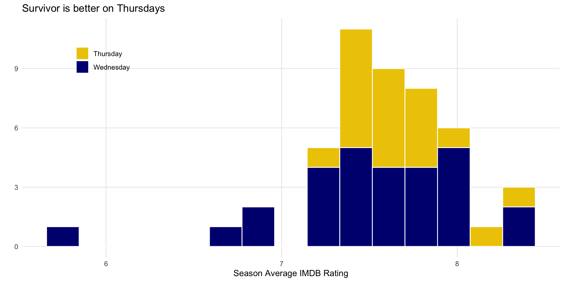
Get rid of .5’s

ggplot(season_summary) + 
  geom_histogram(
    aes(x = imdb_mean, fill = day_of_week), 
    bins = 15,
    color = "white"
    ) + 
  scale_fill_manual(values = c("gold2", "navyblue")) + 
  scale_x_continuous(breaks = c(6, 7, 8, 9)) +
  theme_minimal() + 
  theme(
    legend.position = c(.15, .85),
    legend.background = element_blank(),
    panel.grid.minor = element_blank()
  ) + 
  labs(
    x = "Season Average IMDB Rating",
    y = "",
    fill = "",
    title = "Survivor is better on Thursdays"
  )
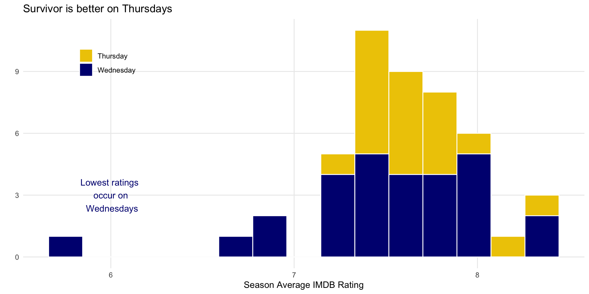
Add an annotation

ggplot(season_summary) + 
  geom_histogram(
    aes(x = imdb_mean, fill = day_of_week), 
    bins = 15,
    color = "white"
    ) + 
  scale_fill_manual(values = c("gold2", "navyblue")) + 
  scale_x_continuous(breaks = c(6, 7, 8, 9)) +
  theme_minimal() + 
  theme(
    legend.position = c(.15, .85),
    legend.background = element_blank(),
    panel.grid.minor = element_blank()
  ) + 
  labs(
    x = "Season Average IMDB Rating",
    y = "",
    fill = "",
    title = "Survivor is better on Thursdays"
  ) +
  annotate("text", 
           x = 6, 
           y = 3, 
           label = "Lowest ratings \n occur on \n Wednesdays",
           col = "navyblue")
Increase text size

ggplot(season_summary) + 
  geom_histogram(
    aes(x = imdb_mean, fill = day_of_week), 
    bins = 15,
    color = "white"
    ) + 
  scale_fill_manual(values = c("gold2", "navyblue")) + 
  scale_x_continuous(breaks = c(6, 7, 8, 9)) +
  theme_minimal(base_size = 20) + 
  theme(
    legend.position = c(.15, .85),
    legend.background = element_blank(),
    panel.grid.minor = element_blank()
  ) + 
  labs(
    x = "Season Average IMDB Rating",
    y = "",
    fill = "",
    title = "Survivor is better on Thursdays"
  ) +
  annotate("text", 
           x = 6, 
           y = 3, 
           label = "Lowest ratings \n occur on \n Wednesdays",
           col = "navyblue")
Plot Design

Which do you prefer?

General guidelines

  1. Show the data, don’t distort it
  2. Choose the right plot
  3. Use color meaningfully and with restraint
  4. Tell a story
  5. Leave out non-story details

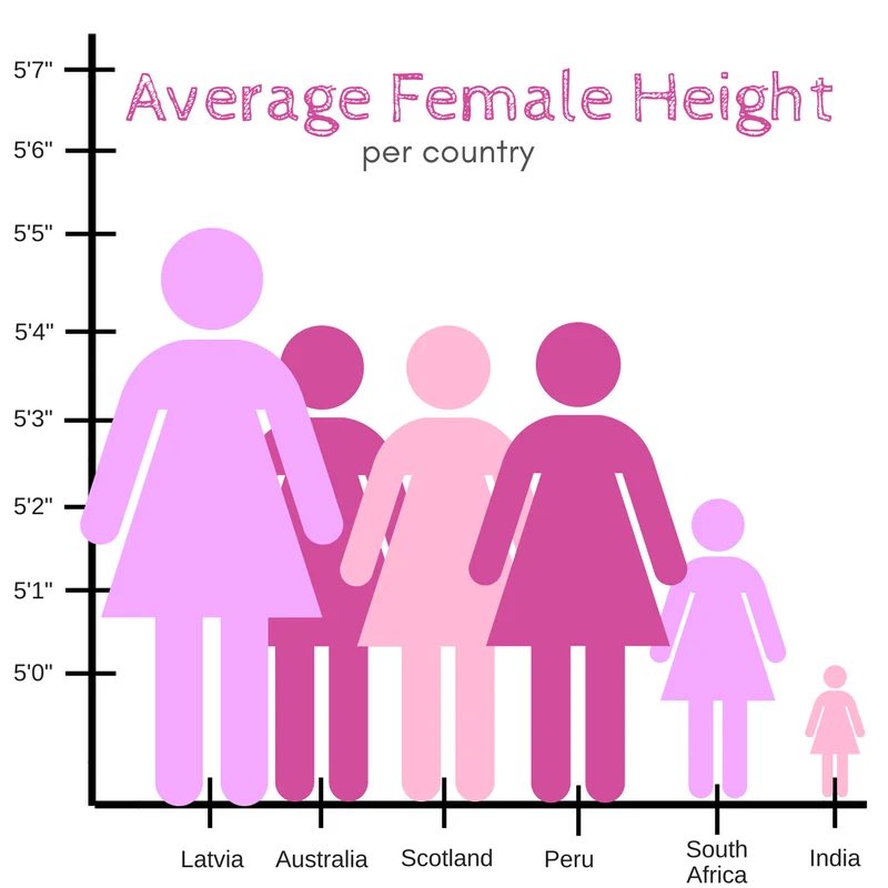
1. Show the data, don’t distort it

1. Show the data, don’t distort it

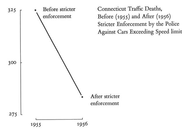
What a huge effect!
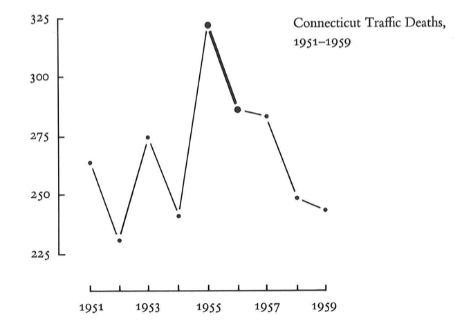
But it isn’t the whole story
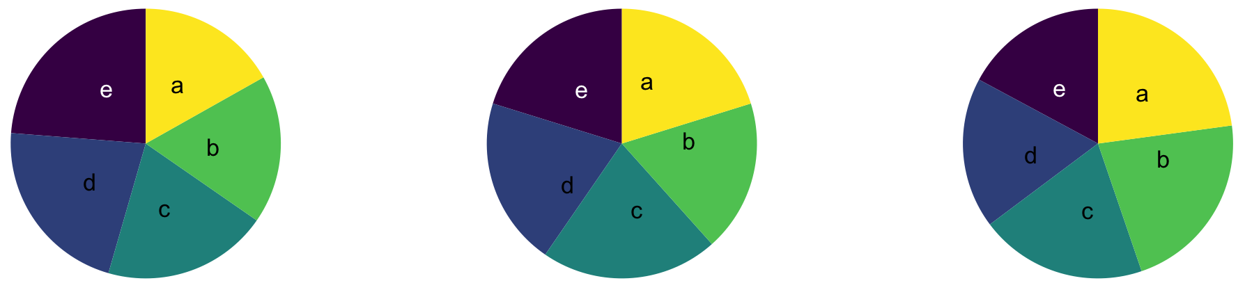
2. Choose the right plot: Which slice is the biggest/smallest?
00:30
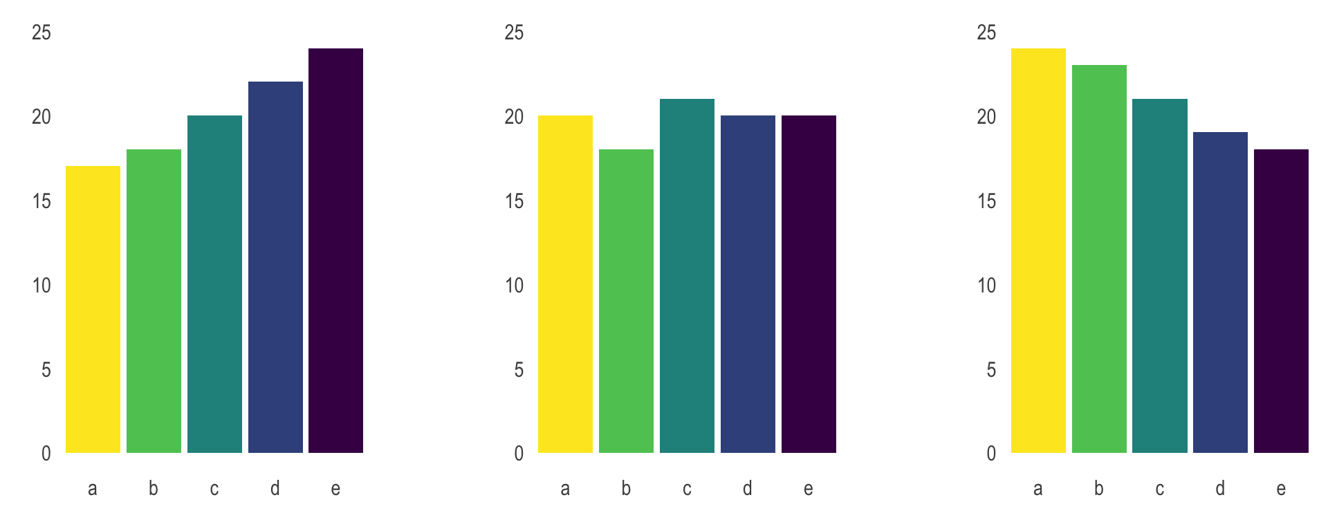
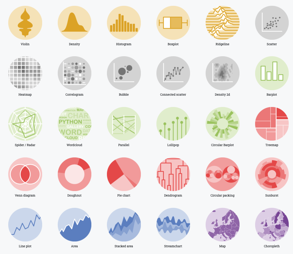
2. Choose the right plot

  • Wilke has good suggestions in chapters 5-16

  • Always stop and think about how easy it is to see the story

  • Try a few different options

3. Use color meaningfully and with restraint
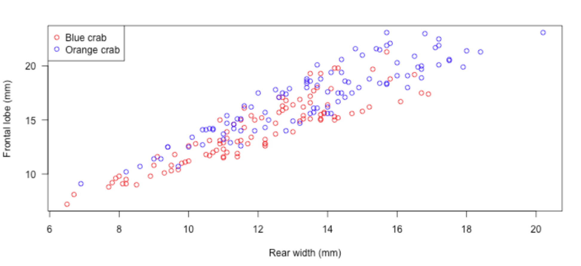
3. Use color meaningfully and with restraint
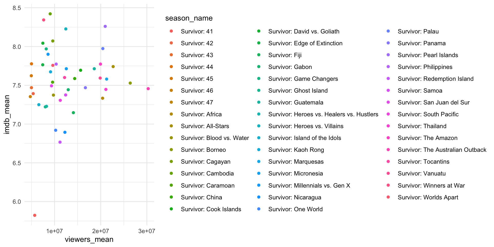
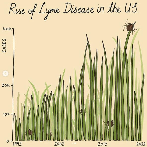
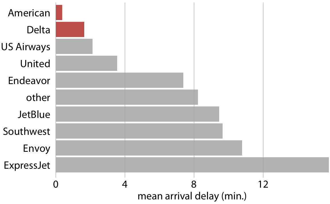
4. Tell a story
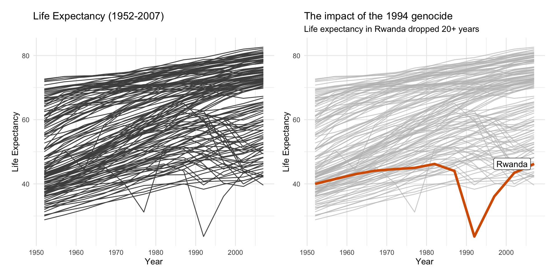
4. Tell a story

One way to do this is by highlighting the important parts
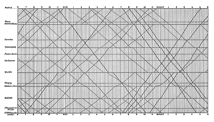
5. Leave out non-story details

Is this train schedule easy to read?
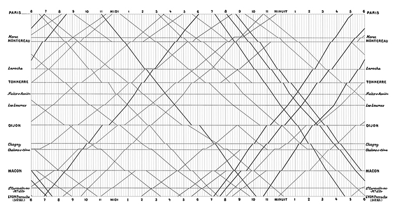
5. Leave out non-story details

Does removing gridlines make it somewhat easier?
Data visualizations have an aura of objectivity

“We focus on four conventions which imbue visualisations with a sense of objectivity, transparency and facticity. These include: a) two-dimensional viewpoints; b) clean layouts; c) geometric shapes and lines; d) the inclusion of data sources.”
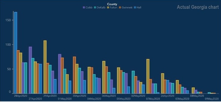
Good graphs can also break these guidelines
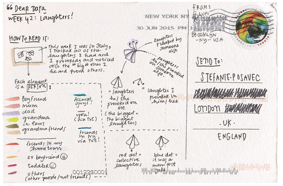
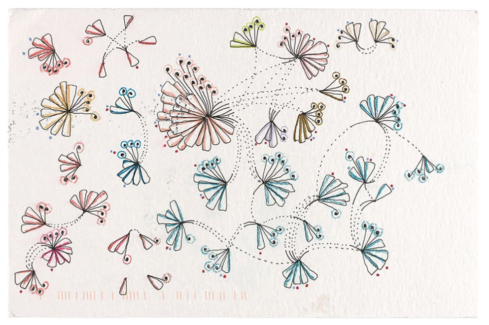
Good graphs can also break these guidelines
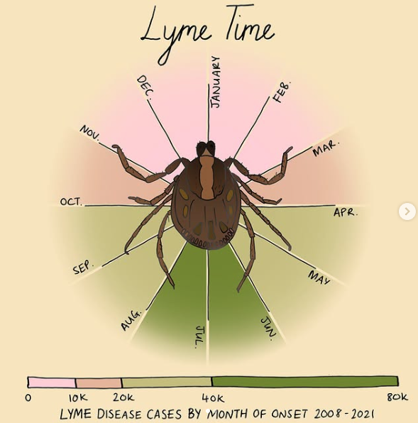
Your turn

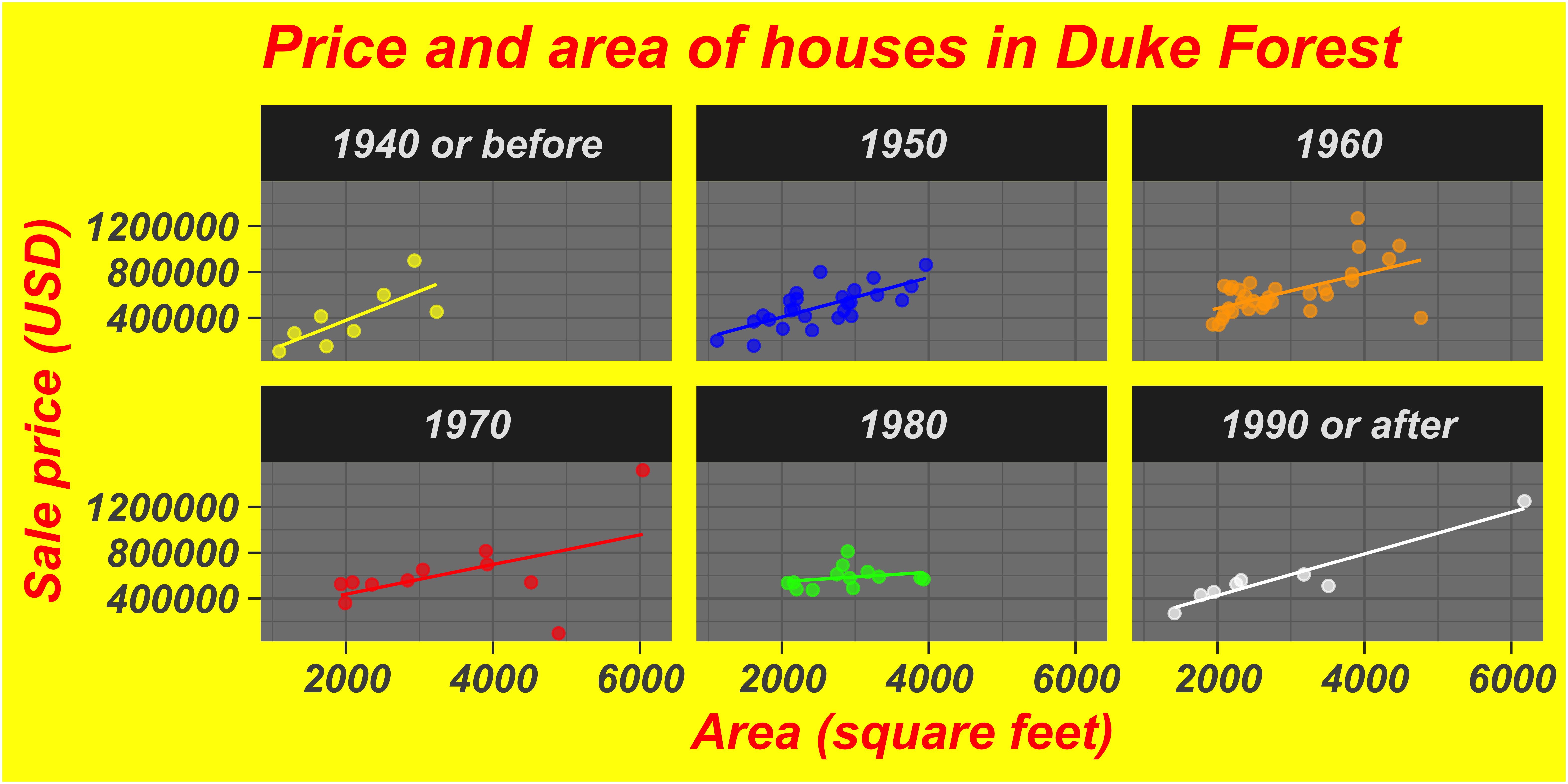
Now that we have the toolkit to make customizations to our plots, and some “rules” for good graphs, let’s break them!

  1. Choose a graph (the one from class today, one from last class, one from homework, etc.)

  2. Make it ugly

  • Change the color scale
  • Choose a complete theme
  • Make at least 3 custom tweaks to the theme options
  1. Explain why it’s ugly (what “rules” are you breaking? what makes it an ineffective graph?)

  2. Post to our slack #social channel when you’re done (you don’t have to post your explanation)