Intro to
Shiny
Day 23
Carleton College
Stat 220 - Winter 2026
Demo
Shiny: High level view
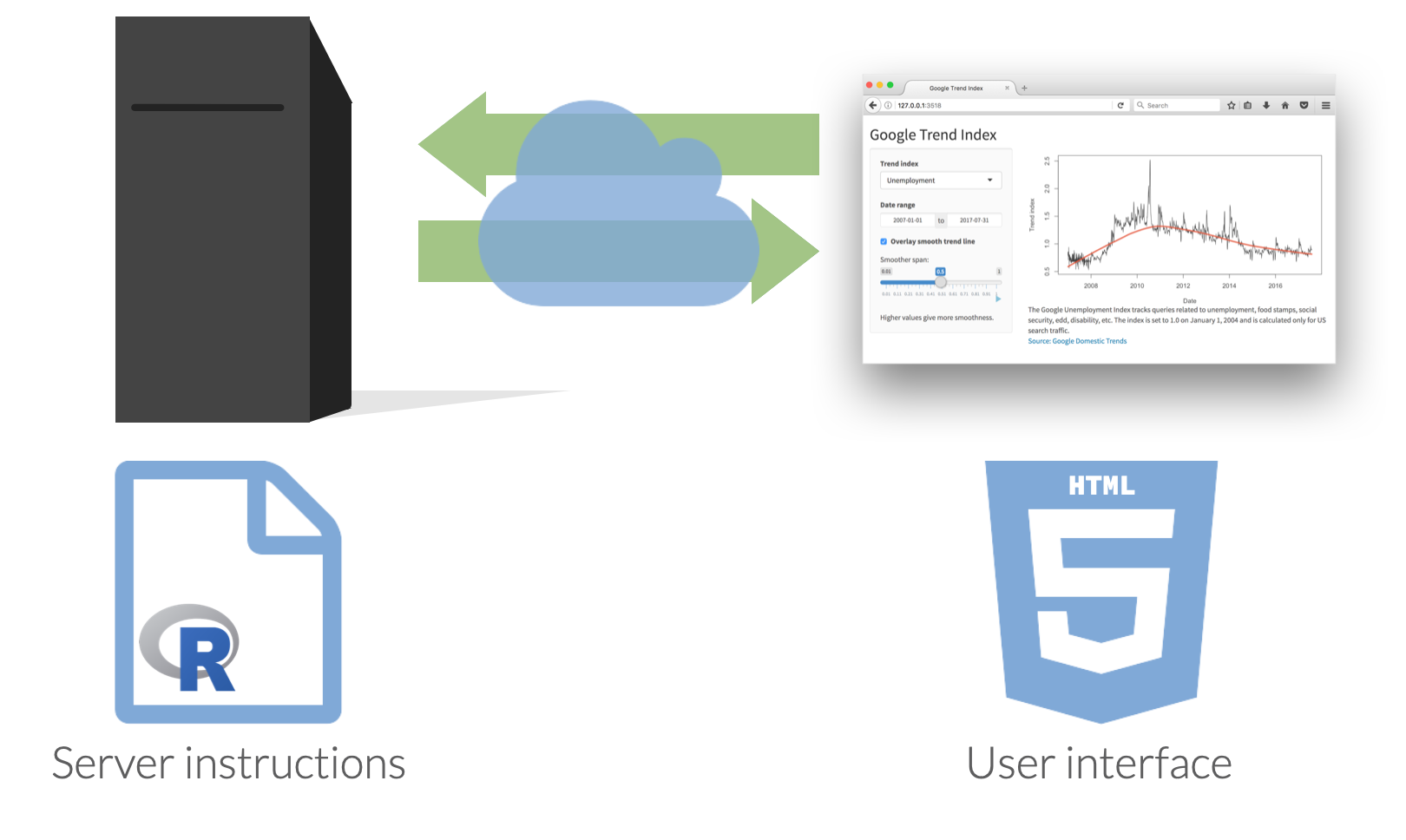
Every Shiny app has a webpage that the user visits,
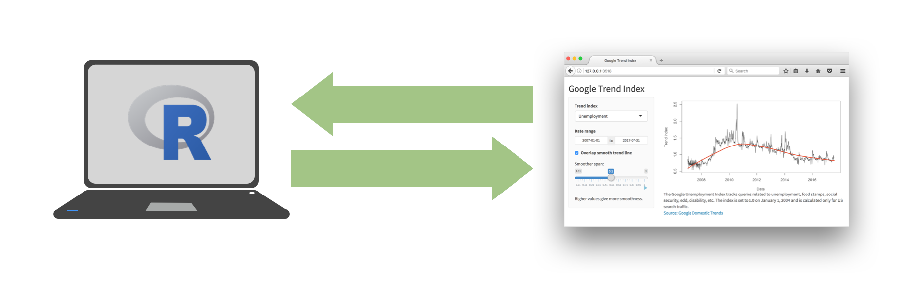
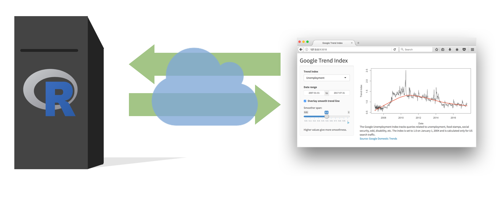
and behind this webpage there is a computer that serves this webpage by running R.
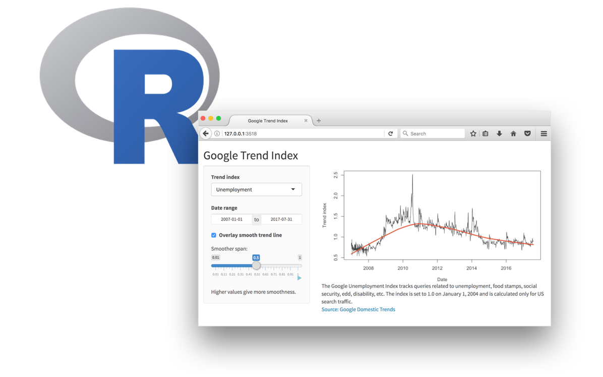
When running your app locally, the computer serving your app is your computer.
When your app is deployed, the computer serving your app is a web server.
Shiny vs. plotly
-
Shiny graphs need to be “connected” to RStudio or an Rstudio server
- Why? Data sets are rewrangled and a new graphic is drawn
plotly isn’t changing the underlying data set/stats being displayed, can be displayed on webpage without an RStudio session
Getting started
Option 1: Embed a shiny plot/table in HTML docs
- Need add
runtime: shinyto your YAML header
Option 2: Can create an app.R file with a ui() and server() function
- For template
New Files > R Markdown > Shiny - New Files > Shiny Web App
What’s in an app?
Defining inputs
-
inputPanel()creates aninputlist consisting of the user’s selections -
selectInput()makes a dropdown select menu -
xcolis the name of the input variable. Make sure input names are unique!
Render output
- Access input values with
input$input_name - Save objects to display to
output$object_name - Build objects to display with
renderSomething()
Add output to the UI function
-
typeofOutput("object_name")will try to pull off theobject_nameelement of theoutputlist - Make sure output names are unique
Add a title
-
typeofOutput("object_name")will try to pull off theobject_nameelement of theoutputlist - Make sure output names are unique
Data: Ask a manager
Source: Ask a Manager Survey via TidyTuesday
This data does not reflect the general population; it reflects Ask a Manager readers who self-selected to respond, which is a very different group (as you can see just from the demographic breakdown below, which is very white and very female).
Some findings here.
Data: manager-survey.csv
# A tibble: 26,232 × 18
timestamp how_old_are_you industry job_title additional_context_o…¹
<chr> <chr> <chr> <chr> <chr>
1 4/27/2021 11:02:10 25-34 Educatio… Research… <NA>
2 4/27/2021 11:02:22 25-34 Computin… Change &… <NA>
3 4/27/2021 11:02:38 25-34 Accounti… Marketin… <NA>
4 4/27/2021 11:02:41 25-34 Nonprofi… Program … <NA>
5 4/27/2021 11:02:42 25-34 Accounti… Accounti… <NA>
6 4/27/2021 11:02:46 25-34 Educatio… Scholarl… <NA>
7 4/27/2021 11:02:51 25-34 Publishi… Publishi… <NA>
8 4/27/2021 11:03:00 25-34 Educatio… Librarian High school, FT
9 4/27/2021 11:03:01 45-54 Computin… Systems … Data developer/ETL De…
10 4/27/2021 11:03:02 35-44 Accounti… Senior A… <NA>
# ℹ 26,222 more rows
# ℹ abbreviated name: ¹additional_context_on_job_title
# ℹ 13 more variables: annual_salary <dbl>, other_monetary_comp <dbl>,
# currency <chr>, currency_other <chr>, additional_context_on_income <chr>,
# country <chr>, state <chr>, city <chr>,
# overall_years_of_professional_experience <chr>,
# years_of_experience_in_field <chr>, …Your turn
- Run the app! What does it show us?
- Read the code: find the inputs and the outputs
- Adapt the app to allow the user to specify what variable maps to the point color in the scatterplot
- Adapt the app to allow the user to filter the data by
annual_salary. Allow values between the minimum and maximumannual_salaryselected. - Adapt the app to allow the user to select whether the plot should have a white background
- Add a histogram that allows the user to select what quantitative variable should be displayed. Add any other interactive elements (e.g., binwidth adjustments) that you want to.